JobPay
The final project of my UX Writing Certification course with UX Content Collective was to craft UI copy, and create a style guide for a fictional app called JobPay. The aim of this app is to help freelancers and business owners track their progress and payments so they can communicate easily with each other and manage projects better.
Everything begins and ends with the user so I stepped into the shoes of JobPay’s two target audiences (user personas below) to understand their goals, frustrations, demographics, and how they may feel using the app. This emphathetic approach proved to be invaluable in creating the JobPay style guide that would set the brand’s tone and voice, ensure consistency in style & formatting, and inform the copy. I also included examples as reference for other UX writers so they would be able to take the guide and easily run with it. Once this style guide was finalized (after a few rounds of addressing the instructors’ feedback), the next task was to edit user flow prototypes for freelancers and business owners to ultimately help and guide the user along their journeys.
Below the user personas are a selection of mockups (including before & after versions) along with my approach behind each copy update.

User persona for freelancer

User persona for business owner
UI copy for onboarding screens
Scenario: Onboarding screens are the first impression for first-time (and hopefully, lifetime) users. But freelancers and business owners are busy, time-starved, and willing to only spend a minute or two at most, to find out more about the app and what’s in it for them.
Problem: The UI copy provided to me was too wordy, clunky, and in some cases, incomplete and missing. CTAs were sloppy, inconsistent and all over the place.
Solution: I kept the headlines short and actionable to show users right away how JobPay can help them. I revised the button UI copy to make it clear and consistent across.
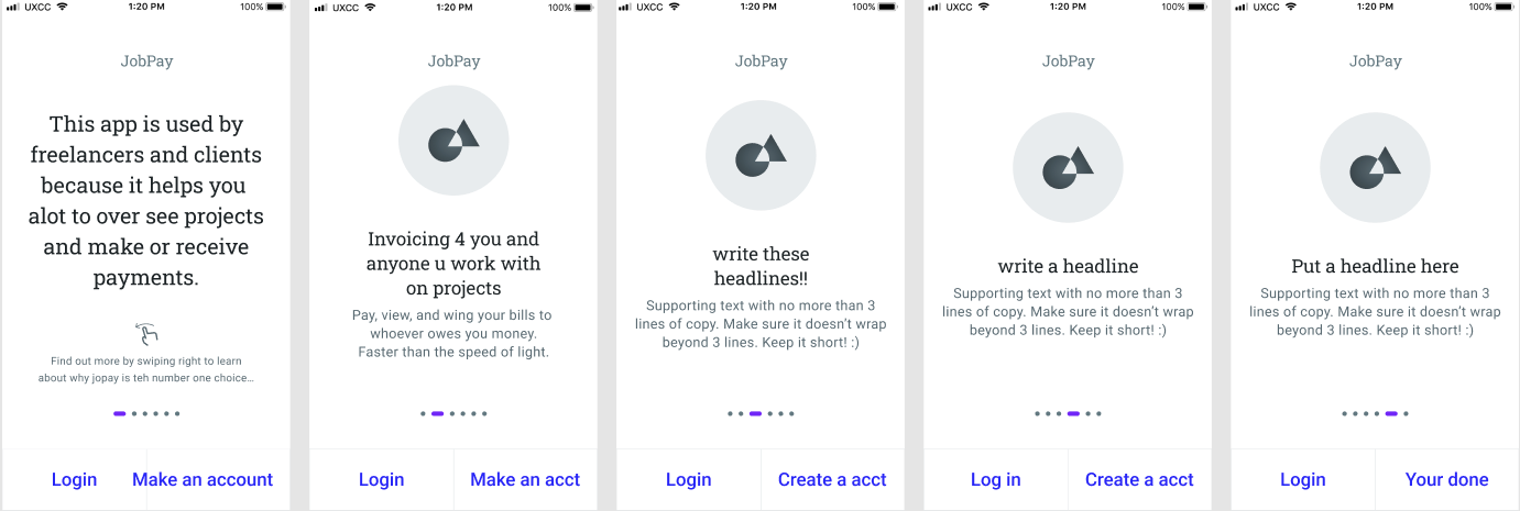
Onboarding screens (Before)

Onboarding screens (After)
UI copy for sign-up form
Scenario: The sign-up form is likely the first interaction users will have with JobPay app. They want the experience to be as intuitive and friendly as possible.
Problem: The UI copy felt cold and aloof. Not exactly a great way to welcome new users and set the right tone for the user’s experience with the product.
Solution: Besides warmer, more welcoming and conversational copy, I also made the sign-up form more user-friendly. I added labels to boxes to indicate where to enter the user’s name, email address, and password. I also added text to the input field to show users where to type. And in the last screen, I added the call-to-action to “Create Project” to make the flow more seamless so users will know exactly what’s next.

Sign-up screens (Before)

Sign-up screens (After)
UI copy for project Invitation from freelancer
Scenario: Kelly, the freelancer, wants to share her project proposal with Tom, the business owner.
Problem: The UI copy was too long. It was difficult to understand how to invite a client and what happens after the message is sent.
Solution: I created simple, easy-to-understand descriptions of what happens after Kelly sends the invitation to Tom. I made the tone warmer and reassuring while making the experience more user-friendly by adding labels to boxes and text to the input fields.

Project invite screens (Before)

Project invite screens (After)
Key Takeaways
Keep it simple and clear: People are busy. They need short, engaging copy and enough information to be able to quickly find what they’re looking for. Working on this project helped me to understand and appreciate the importance of brevity and clarity.
See the big picture: And to not just focus on individual flows or the screen in front of me. I learned to constantly take a step back to consider how each text impacts everything else and works together for the user experience.
Help not sell: As a seasoned copywriter who is used to persuading and selling through words, this exercise necessitated a shift in mindset. I had to put my copywriter hat in the back seat, and put the user in the driver seat, to help guide them from point A to point B. And make that process as easy and engaging as possible.